Spring - Summer 2019
User Experience Research & design // User Interface Design // Project Management
LQID LIFESTYLE BANKING APP
Role: Product Design Specialist

www.livelqid.com
LQID is a lifestyle banking and digital commerce ecosystem. The company operates two separate businesses: a digital bank and a mobile social marketplace. Users are able to open a bank account and perform all banking necessities within the app, without ever having to go into a physical space. The app also hosts a marketplace, where users can purchase items directly through their LQID bank accounts and gain rewards for doing so.
When LQID asked me to join, they were in need of an entire refresh of their current app v1. Their app at the time also consisted of a seller platform, in which I thought was not very user-friendly and made the app too bloated when it came to number of features. Before I started my first semester of grad school, I joined the team under a 6-month contract to strategize and lead the redesign of LQID app v2.
My structure for this workflow included:
Clarify business vision and mission
Research and identify LQID Bank and Marketplace personas
Identify user needs and tasks
Create user flows and wireframes
Form LQID Design Principles
Create new LQID Design System
Create user interface
Create user interactions

VISION AND MISSION
The LQID product is unique in its nature and doesn’t have many examples that we can use for comparison or reference. I suggested to my stakeholders that we needed to step back and talk about the business objectives, which were still unclear to most people in the company. The directors all got together to brainstorm and finalize a deck that clarified customer goals, business goals, and unique selling points the company wanted to achieve with the LQID product, within both the banking and marketplace features. This paved way for me and my design team to further understand how to approach our next step: user personas.
At this stage, the stakeholders ultimately made the decision to consolidate the marketplace and banking apps into one “super app”, where users can shop and bank all on a single platform without ever closing the app. This clarification was necessary for structuring the information architecture for our product.
2. USER PERSONAS
This bit of the process took more effort due to the fact that we were based in Bangkok, Thailand, but designing a product for the UK market. Fortunately, my stakeholders and one of my design team members were from the UK and were able to give clear perception of what that market was like. The company also conducted focus groups in five different cities in the UK back in 2017 while they were still conceptualizing their banking product. These interviews were all professionally recorded. I sat through all of these interview videos and jotted down key pointers from the consumers in terms of pain points and requirements when it came to banking.

As for the marketplace, the company had also done some in-depth interviews with current sellers on their platform. I watched those interviews and categorized those sellers into my own understanding of why they decided to start selling on the LQID platform.

Once I gathered my information, I conducted workshops with my team and some stakeholders to discuss and finalize our personas. I shared my takes with the group, and we started mapping key points that would make up each persona.


Our efforts resulted in five banking personas, four marketplace buyer personas, and four marketplace seller personas.


3. USER NEEDS AND TASKS
With the final personas in place, I then started listing out the different needs each persona had before turning them into ranked tasks on the app. While doing this, I looked at the existing features within LQID app v1 to make sure I wasn’t missing any of the important functionalities that were in the works of being developed.

Glimpse of the banking user needs.
To turn these needs into tasks and rank them in order of importance, my team and I created a calculation system based on factors such as “hot cookie” requirement from our stakeholders, whether it was already in development or live, the impact the feature will have on our users, how fundamental it is, and how much effort it currently takes for our users to carry out that task if the feature wasn’t implemented. The final sum of these factors determined how high each task ranks. This helped us prioritize our design and development roadmap, and cut out some features that weren’t going to be feasible for this version.

Glimpse of ranked tasks for the banking product.
4. USER FLOWS & WIREFRAMES
After the ranked tasks were ready, I separated the tasks into categories that would help me organize them once I started putting them into the app as features. I then created user flows for all of those tasks by starting off with simple text-based diagrams and reviewing them with my team and my stakeholders before turning them into more fleshed-out wireframes.

User flow: Welcome screens

User flow: Transfer to new payee
After all the flows had been approved, I created an overarching app structure with the prioritized features to give my team and stakeholders a sense of how all these flows will be connected.

Using Figma, I started wireframing the flows, starting off with Apple iOS elements. During my 6-month contract, I was not able to get started on the Android version and handed it off to the team.

Wireframe: Welcome screens
5. DESIGN PRINCIPLES
As I was working on the wireframes, my PO and I had to start thinking about how we would get the entire design team (that consisted of nearly 20 UX and UI designers) on the same page as us, especially after I hand this project off to them before I leave. We came up with concrete design principles that all designers within LQID would have to adhere by, in order to keep consistency within our product ecosystem.

6. DESIGN SYSTEM
Once I was done with the major wireframes, I handed the smaller features off to the other designers to start working on creating a LQID Design System. Before I joined the company, LQID designers were making their own decisions in terms of colors, font sizes, and types of icons. This had led into major inconsistency throughout the app.
Since this was my first time ever creating a design system on my own, I did plenty of research to find the most suitable method for LQID and looked at examples from websites like www.designsystems.com.
I first created a word document outlining the structure of this design system, to give myself and my team clarity. I also made a UI elements list to make sure we weren’t missing anything.

Then, I started creating the actual guidelines within Figma.

7. USER INTERFACE
Because I only had half a year to get all of this done, my team and I worked on the Design System and UI simultaneously, communicating to each other as much as possible to make sure we were aligned. Before my time at the company was up, I was able to complete the full UI of certain selected screens that would be used to show investors.

The screens that we selected to show were the ones that best explain how the LQID app works, with both banking and marketplace features.
Our final prototype showcase consisted of our redesign of the home screen, which is a stream of personalized updates for the user, separated into Now (combined recent updates), Shopping, and Banking.

LQID Home Streams
We also created screens for all the basic functional screens within the bottom navigation bar.

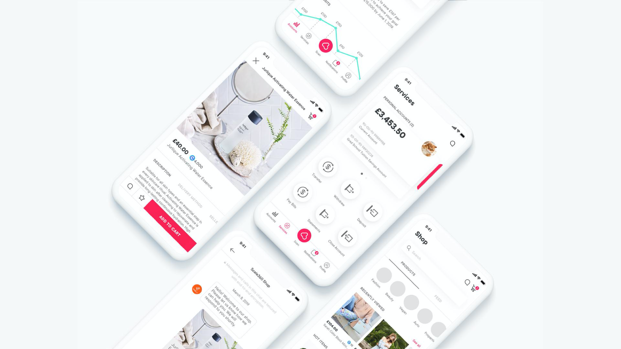
LQID Banking screens

LQID Shopping and Chat screens
8. HAND OFF
I was not able to finish the user interface and user interaction for the entire version 2 of the LQID app, but I did set up a solid system and guideline for the remaining team to use and follow. The app is currently in the process of designing the remaining pages and development.
Digital product design is still an emerging field in Thailand. Before leaving, I had the pleasure of leaving behind some personal design values and understanding through an interview with the LQID team for their TechTalk series. I hope I had inspired and paved way for the existing designers at LQID and in Thailand to continue growing and learning to create awesome experiences.